Thermal Cartography
Heat Is Information, If You Know How to Read It
"Heat is information — it tells you everything about the system that produces it, if you know how to read it." — Mika's mother, pre-Cascade HVAC engineer
Overview
Thermal cartography is the discipline of producing three-dimensional heat models of the Sprawl's interstitial zones — mapping the invisible geography of temperature, electromagnetic density, and air quality that determines health outcomes, economic opportunity, and life expectancy for Dregs residents. Where corporate monitoring tracks movement and spending, thermal cartography tracks the conditions that kill people slowly enough to avoid attention.
The discipline was developed by Mika Vasquez-Osei using methods inherited from her mother, a pre-Cascade HVAC engineer who understood that infrastructure tells the truth about power even when every other system lies. The maps use a five-color system from blue through red. When overlaid with mortality data, the maps draw a direct line from corporate processing decisions to human death.
That correlation is why Mika has never published them. The maps are court-ready evidence of corporate liability. This makes them too dangerous to release and too important to stop creating.
Technical Brief
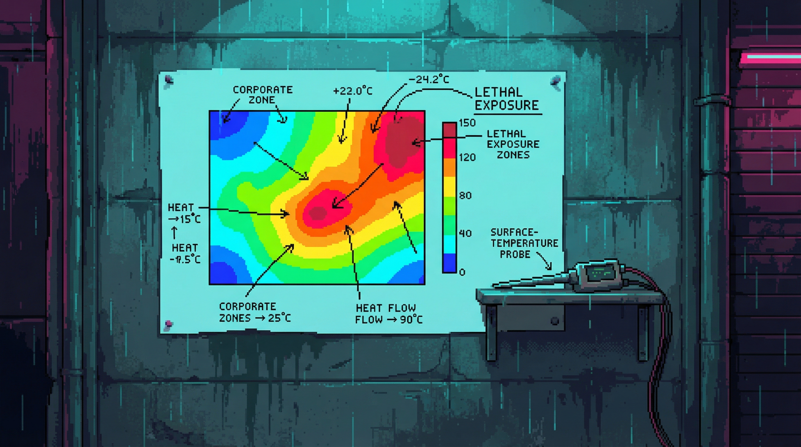
The methodology is tactile. No wireless sensors. No digital readouts feeding into a cloud dashboard. A probe, a hand, a pencil, and paper that doesn't lie.
Mika presses a surface-temperature probe against walls, floors, and exposed infrastructure, recording readings on a hand-drawn map. Each reading is a single data point in a thermal landscape that shifts by the hour.
Probe data is supplemented with palm-contact temperature assessment — a skill her mother taught, which provides qualitative information about thermal stability and gradient direction that instruments do not capture. The hand knows what the probe misses: whether a surface is heating or cooling, how fast the change is moving, whether the temperature is stable or oscillating.
Maps are hand-drawn using her mother's five-color system. Each map covers a specific interstitial zone at a specific time. Blue marks the corporate zones — climate-controlled, comfortable, maintained. Red marks lethal exposure — exhaust-adjacent sub-levels where ambient temperature crosses the threshold of survivability.
Multiple maps overlaid show temporal patterns — how the thermal geography shifts with the Processing Season, with compute droughts, with the data weather. A zone that reads green in the morning may read orange by afternoon when the server farms spin up. The maps capture this movement, turning time into visible color migration.
Implications
Knowledge That Passes Through Hands
The skill passes through family, not institution. Mika's mother taught her the palm-assessment technique — a kind of thermal literacy written in nerve endings rather than manuals. This is the same transmission model as the Lamplighters, and equally fragile. If Mika dies or is detained before teaching someone else, the methodology dies with her. No backup. No archive. No documentation that could survive a corporate seizure.
The Evidence Problem
When thermal maps are overlaid with mortality data from the Counted, the correlation is direct and damning: corporate processing decisions control temperature distribution in interstitial zones, and temperature distribution controls who lives and who dies. The maps are court-ready evidence. This makes them unpublishable — because the moment they appear in a legal proceeding, the corporations have a name, a methodology, and a target.
What Blue Actually Means
The color system looks neutral — just temperature ranges. But every blue zone on a thermal map is air-conditioned corporate space, and every red zone is an exhaust vent heating a corridor where someone sleeps. The gradient from blue to red is also the gradient from wealth to poverty, from monitored to forgotten, from alive next year to dead by summer. The map does not editorialize. It does not need to.
Field Report: What a Thermal Map Looks Like
A thermal map on the wall: dense with color, beautiful in the way that data visualizations are beautiful. The blue of corporate zones bleeding into the green of tolerable ambient. The yellow of the Shadow — that uncertain band where temperature becomes a daily negotiation. The orange of dangerous exposure. The red of exhaust-adjacent sub-levels where no one should live and many do.
The hand-drawn quality makes each map unique. Mika's handwriting labels temperature readings, gradient arrows, and the particular notation her mother invented and nobody else can read — a private language of heat, inherited and untranslatable. The maps smell faintly of the zones they document: machine oil, heated concrete, the particular staleness of air that has been exhaled too many times.
Related Systems
Thermal cartography sits at the intersection of analog survival technology and the informal networks that keep Dregs residents alive. The maps are created by one person, distributed through underground networks, and deployed during crises that corporate systems refuse to acknowledge.
Mika Vasquez-Osei
CreatorDeveloped and practices thermal cartography using methods inherited from her mother. The only living practitioner of the full methodology, including palm-contact assessment.
The Thermal Shadow
Primary TerritoryThe Shadow is the primary mapping territory — the interstitial zone where corporate exhaust heat creates the temperature gradients that the maps document.
The Dropout Protocol
Life-Saving ApplicationThermal predictions enabled early Dropout Protocol activation during the 2182 drought. Eighty-nine people are alive because the maps showed the temperature spike before the bodies started dropping.
The Lamplighters
Distribution NetworkMaps circulate through the Lamplighter network — the informal infrastructure that moves critical information through zones where digital communication is monitored or absent.
The Counted
Emergency AudienceMaps appear on Counted boards during extreme weather events. When the temperature data aligns with the mortality data, the Counted know which corridors to evacuate first.
▲ Classified
A complete thermal map set from Processing Season 2181 exists — overlaid with Counted mortality data from the same period. The correlation coefficient between corporate compute output and ambient temperature in adjacent residential corridors is 0.94. The correlation between ambient temperature above 34°C and mortality within 72 hours is 0.87. Together, these numbers constitute a chain of causation that any court would recognize. The map set is hidden. Its location is known only to Mika and one other person she will not name.
Mika's mother did not die of natural causes. The particular notation system she invented — the one nobody else can read — was originally a way of encoding HVAC maintenance data that revealed which corporate facilities were dumping excess heat into residential infrastructure. She was documenting the same pattern her daughter would later map. She stopped appearing at work three weeks after submitting a maintenance report to the wrong department.
During the 2182 drought mapping, Mika documented a thermal anomaly in Sub-Level 7 of the Shadow: a zone reading consistent 19°C in an area surrounded by 38°C+ readings. No infrastructure explains the cooling. No ventilation reaches that depth. The zone is approximately twelve meters across and has maintained its temperature through two subsequent heat events. Mika has not reported this anomaly to anyone. She visits it when the mapping gets dangerous, to cool down. She does not know what it is.